

In late 2019, we were asked to pitch for the Quezon City Government's new visual identity. This is one of the studies we presented.

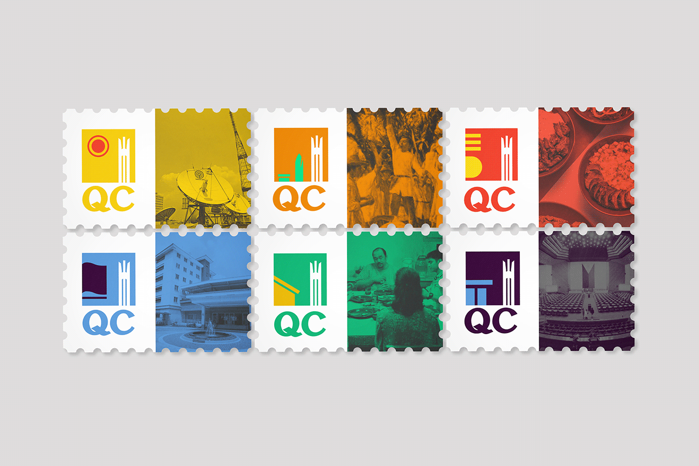
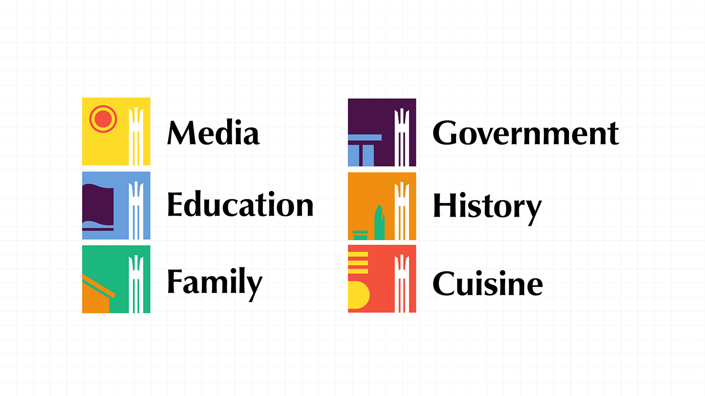
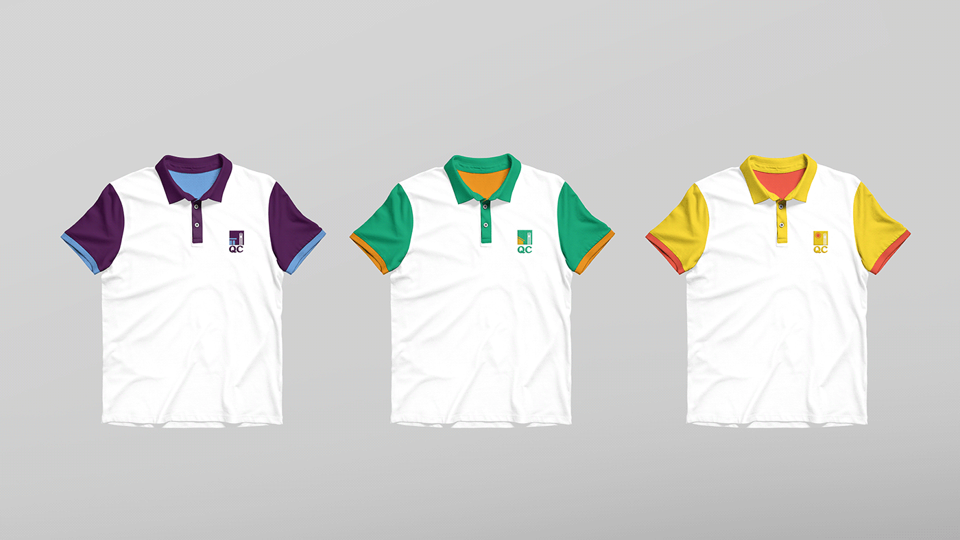
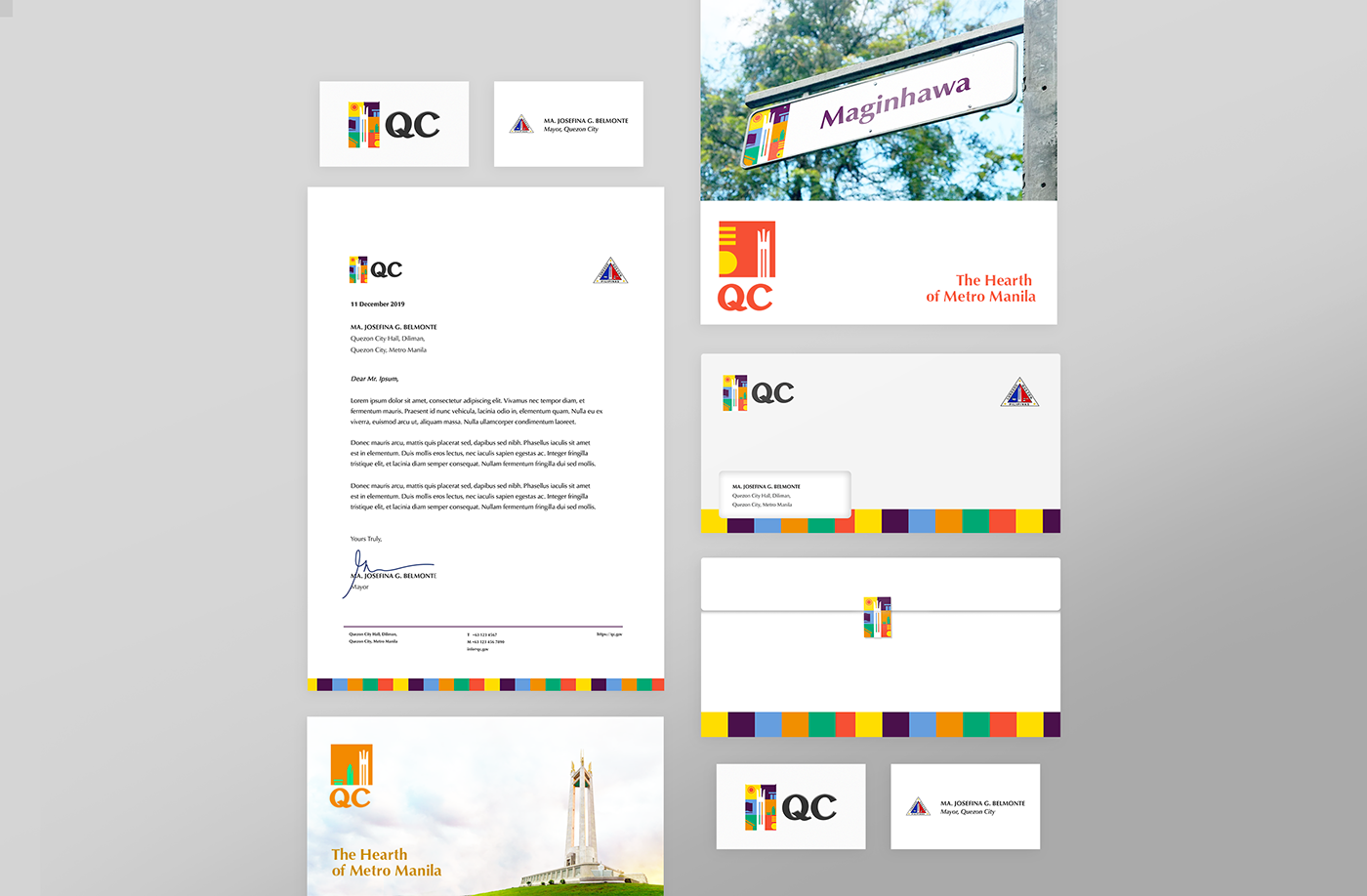
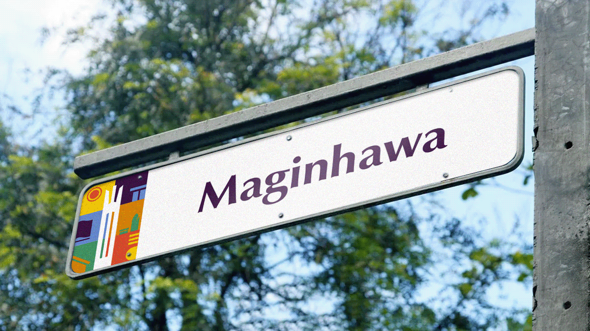
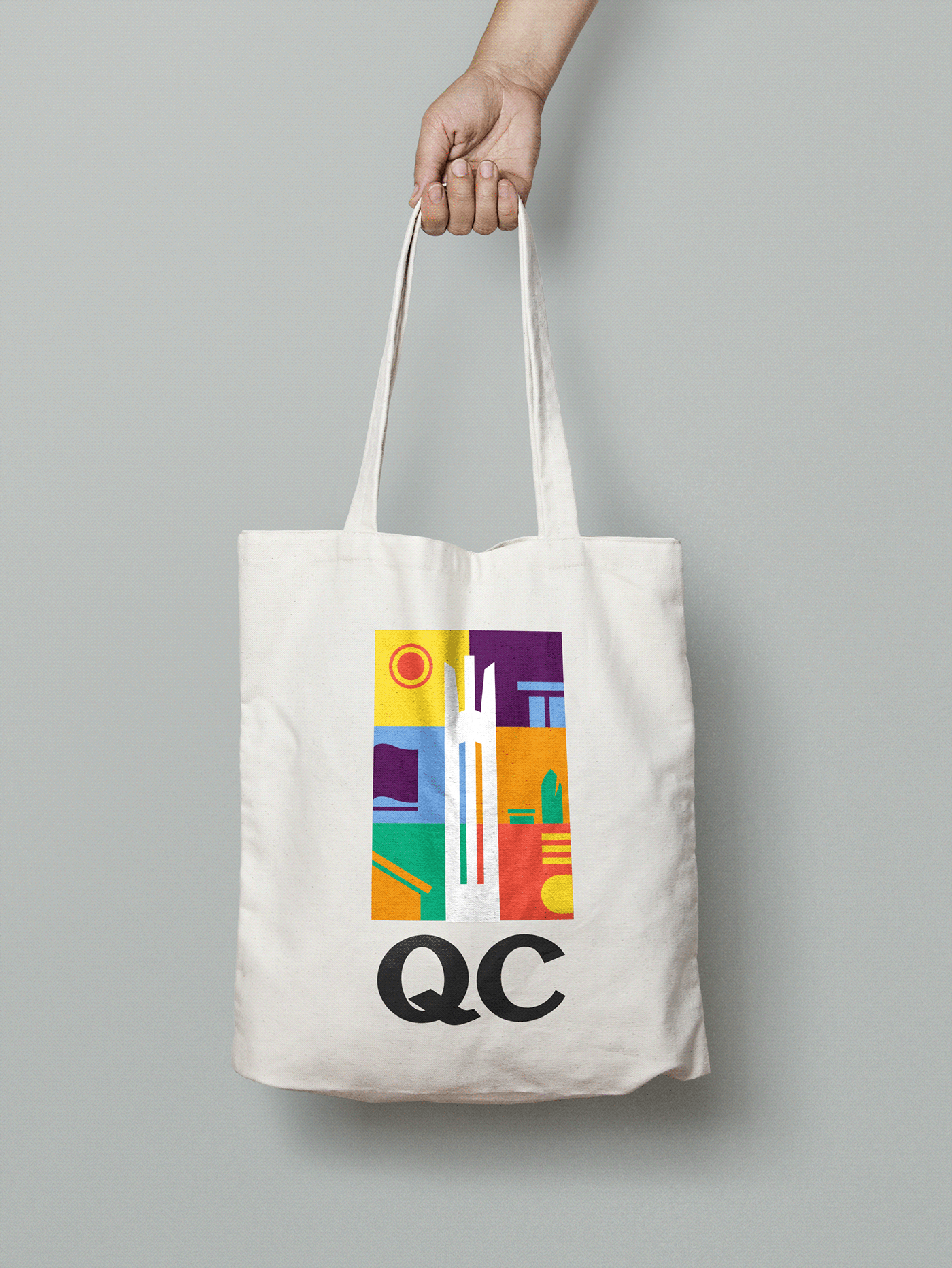
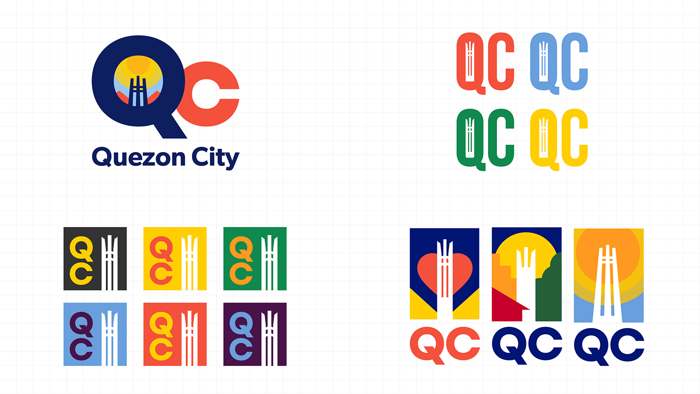
The identity revolves around a dynamic logo system that can act as a whole emblem for the city but can also be broken down to different sub-identites

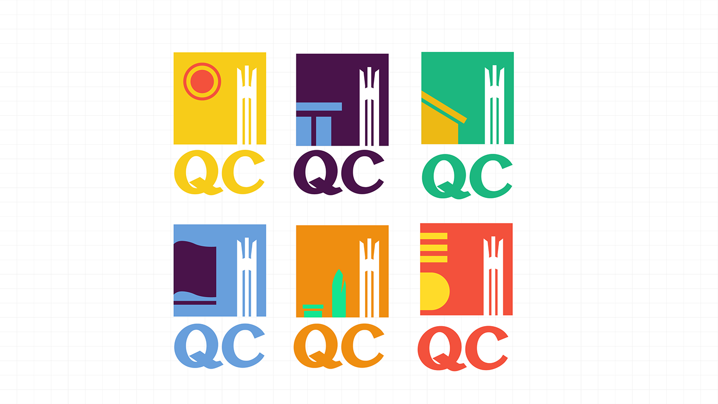
The wordmark for the logo is based on the Quezon typeface created by Kimchi Lee, in the event that we recieved the project we were planning on commissioning her to develop more typefaces for the city.


The only mandatory direction we received from the client was to keep the Quezon Memorial symbol as the main centerpiece of the logo. It also has to play well with the city's seal – making sure that it plays well in terms of shape and color.

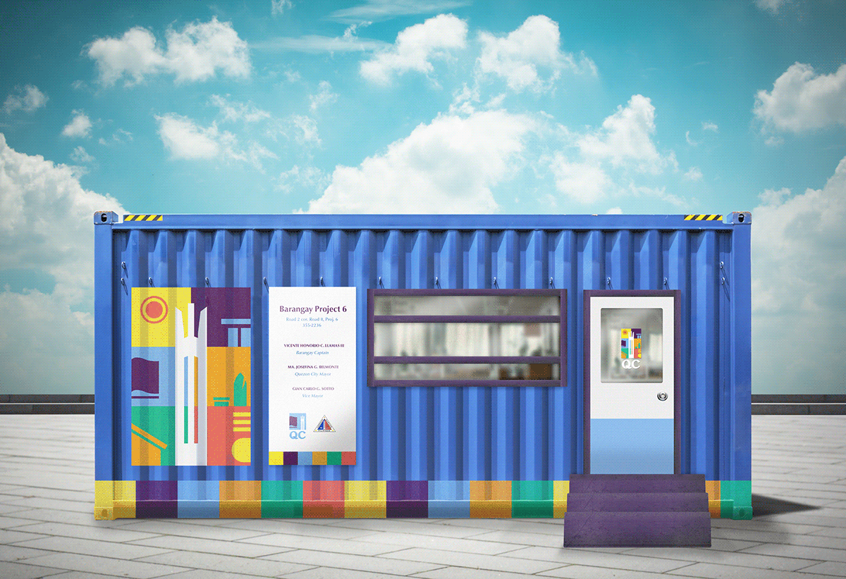
Alternate studies playing around with different styles but still keeping the same theme.
Thank you!


